
MY BRAND
MY BRAND
Creating a brand that felt very personal was very important to me. I wanted to create something that represented my modern, abstract style, while also showcasing my flexibility across multiple mediums. This is the result:
My brand mark utilizes a Venn diagram design surrounded by a border to evoke the look of a virtual reality headset with its two lenses. I chose this due to immersive experiences being my main concentration in my art. The Venn diagram design adds to this by representing how these experiences intersect various mediums of digital art into one vision.


My word mark is constructed out of curved lines and circles to render my name in an abstract, geometric format. The two ‘O’s in my first name reference the design from the brand mark, connecting the two.


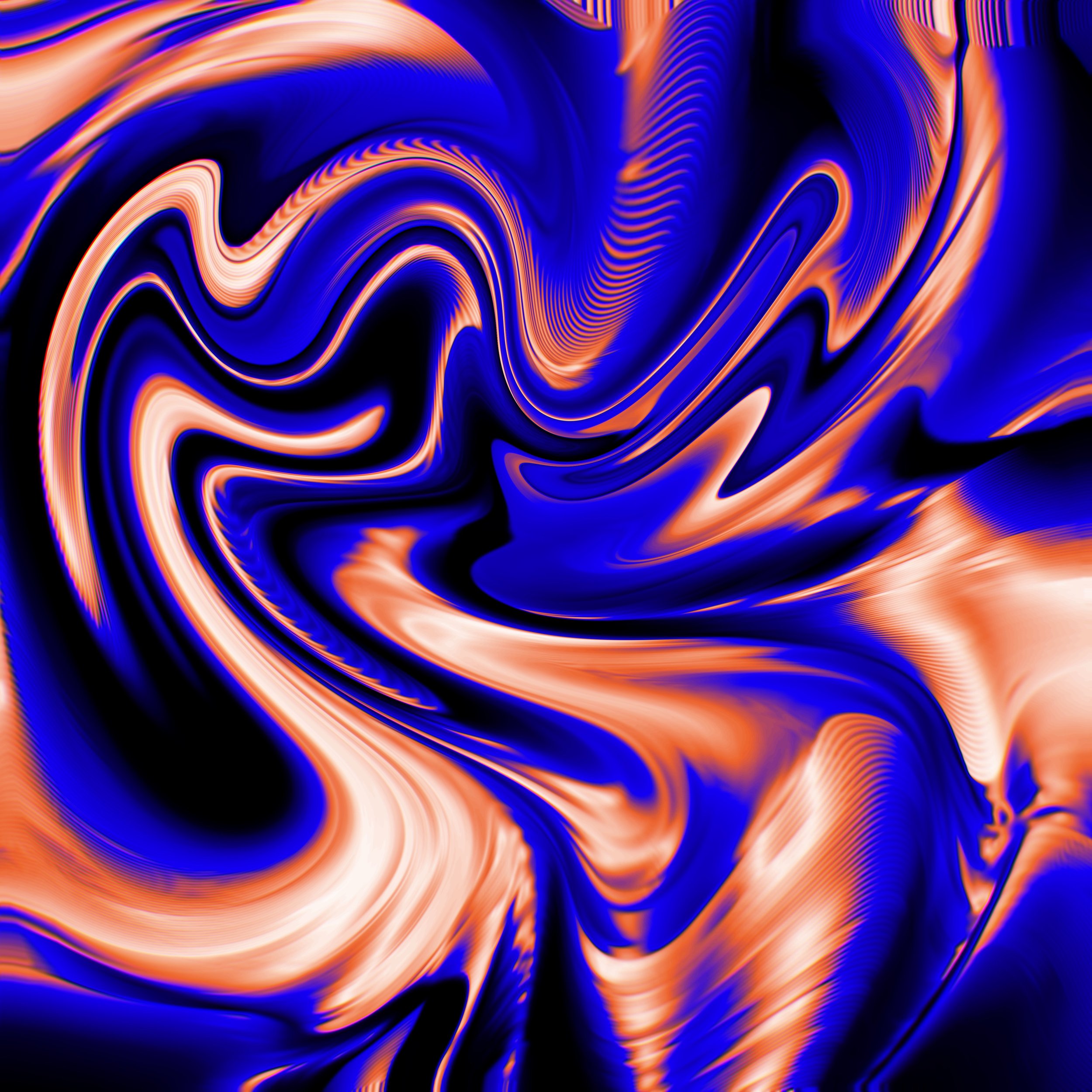
The chromatic styling seen in the renderings of my brand mark and word mark represent how anything a person can imagine can be reflected through virtual and augmented reality experiences. The high contrast, blue and orange color scheme symbolizes my experience across a multitude of contrasting digital mediums, and how they can work together to become something new & innovative.
This philosophy is expanded upon with the design below, which I use frequently across my branding. The waves of blue and orange swirling together, occasionally intersecting to create a magenta, represents intersecting mediums and techniques to create new experiences.


